David Hockney’s Love Affair with Opera

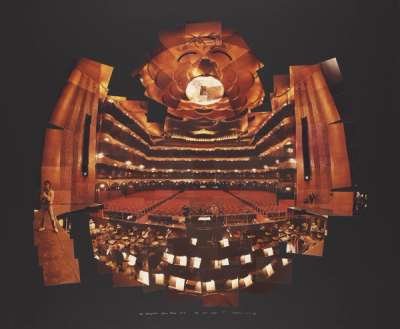
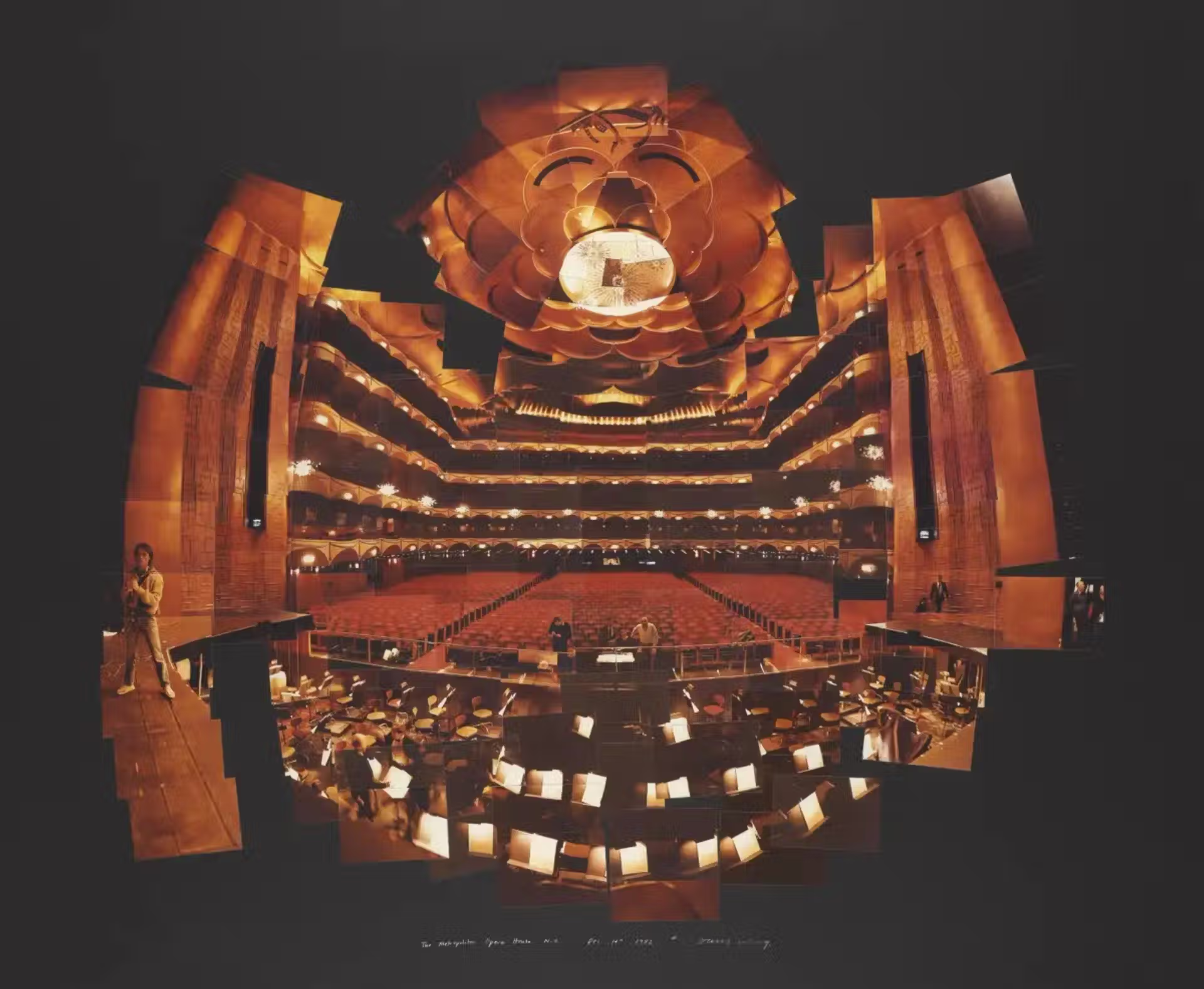 The Metropolitan Opera House © David Hockney 1982

David Hockney, renowned worldwide for his vibrant, luminous paintings capturing the essence of California pools and the Yorkshire countryside, has consistently pushed the boundaries of his artistic endeavours. While the public is familiar with his colourful landscapes and innovative photo collages, many might be surprised to discover that Hockney's talents are not confined to the world of static art. Indeed, the artist's profound love affair with opera and theatre has generated some of the most iconic set and stage designs of the modern era. This synergy resulted in sets that are not just backdrops, but co-stars in their own right.
Hockney and the Stage
For all the success his opera sets would achieve, Hockney was not always passionate about the medium. In an interview in 1970, he said “Well, I'm not that interested in the theatre itself. I did one play, I designed Ubu Roi. When I was doing that, I suddenly realised that a theatrical device in painting is quite different to a theatrical device in theatre. I'm really not interested in theatre design or anything.” The play he is referring to a 1966 production staged at London’s Royal Court Theatre, which marked Hockney’s first foray into set design. Although he was initially trepidatious about the project, thinking that his paintings’ theatrical devices would be contradictory in an actual theatre, he was eventually convinced and created big paintings that “dropped down with big ropes on them like a joke toy theatre.”
All in all, Hockney would go on to design sets for eleven operas over the course of seventeen years, starting in 1975. He has had various levels of involvement, including designing sets, costumes and posters. Much like his paintings, Hockney brings his distinctly Pop sensibility to his set designs, which are characterised by bright and vivid colours that often clash against one another. They often feature surrealist elements, using size and scale to create a sense of perspective.
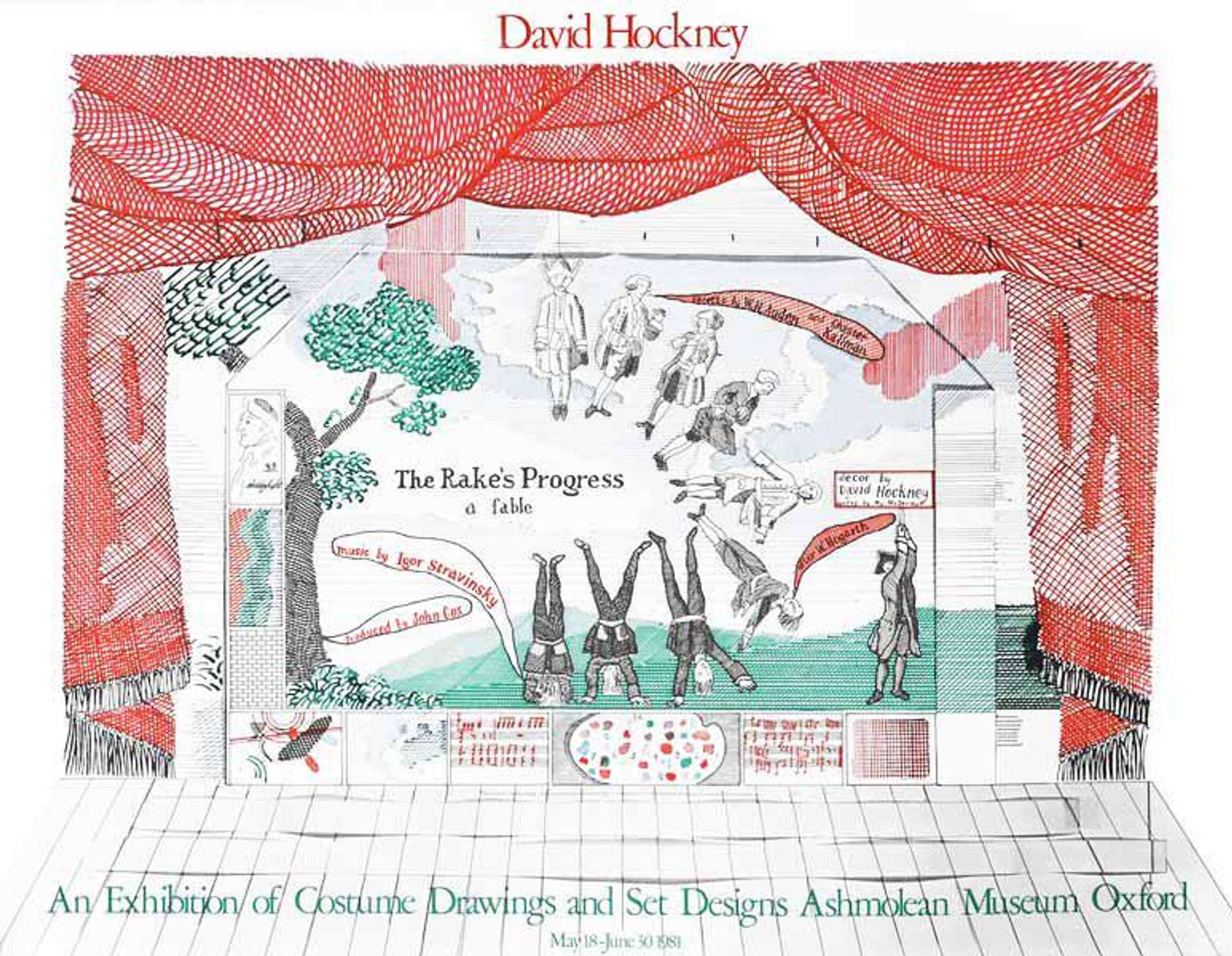
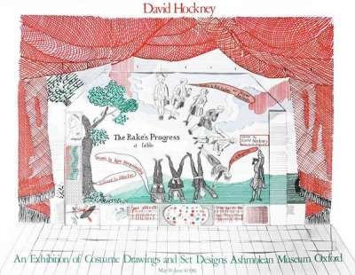
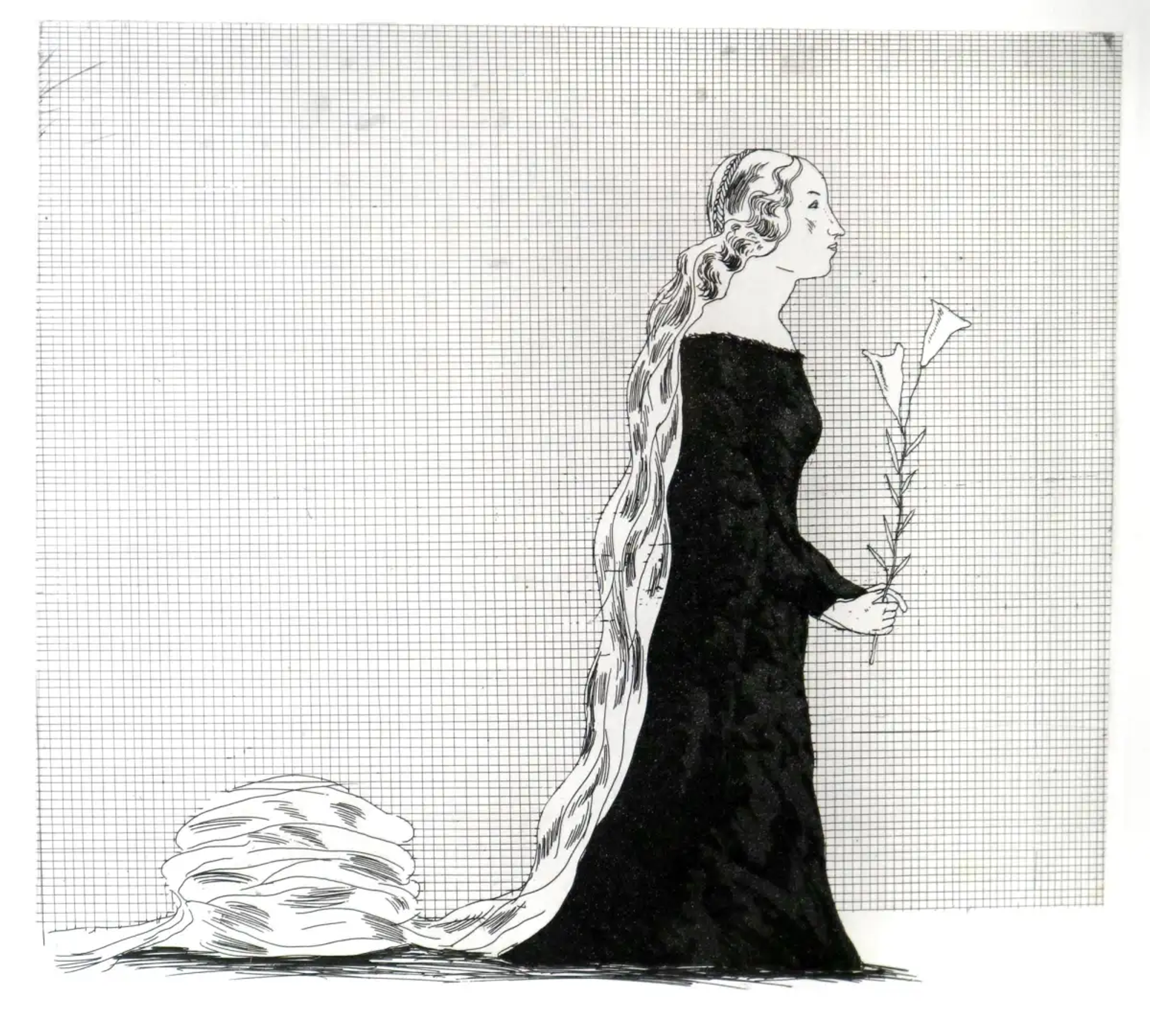
The Rake's Progress (1975)
Hockney’s first foray into opera designs came in 1974, when he was asked to design the set and costumes for a production of The Rake’s Progress for the 1975 Glyndenbourne Festival. Hockney made sense as a designer: like Stravinsky, he had also been inspired by William Hogarth’s series of the same name, and had created his own version of it in 1963. Alongside director John Cox, Hockney created an evocative set, using cross-hatching and parallel lines reminiscent of engraving techniques to mimic Hogarth’s own prints.
This is the set with the most muted colour palette in all of Hockney’s oeuvre, which contributes to the feeling of watching an engraving come to life. Hockney said: “The Rake’s Progress came at a good time for because it was a period when I was trying to figure out what to do in painting. So when this came along in 1974 it ended something for me and took me into something else.”
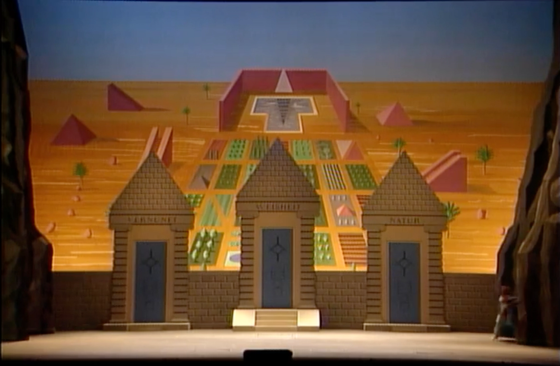 Image © The Met / Die Zauberflöte 1991
Magic Flute (1978)
Only a few years later, Hockney created the set design for the Magic Flute for the 1978 Glyndenbourne Opera Festival. His production then travelled the world, having been performed at the Metropolitan Opera in New York City and the San Francisco Opera.
In Mozart's Die Zauberflöte, Prince Tamino – aided by a magical flute and the bird-catcher Papageno – seeks to rescue Princess Pamina from the enigmatic Sarastro, encountering trials that test love, virtue and wisdom along the way. Hockney’s produced 35 backdrops for the work, which are characteristically bright and colourful, but still flatly painted like canvases behind the stage. He also took inspiration from art history, referencing Paolo Uccello's dragon.
A New York Times review of the 1991 production staged at the Met stated that “his stage pictures unerringly worked their magic… Mr. Hockney's selection of hues and playful ways of juxtaposing them reminded one of a child's first uninhibited experiments with water colors or a box of crayons.”
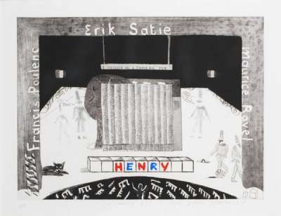
French Triple Bill (1981)
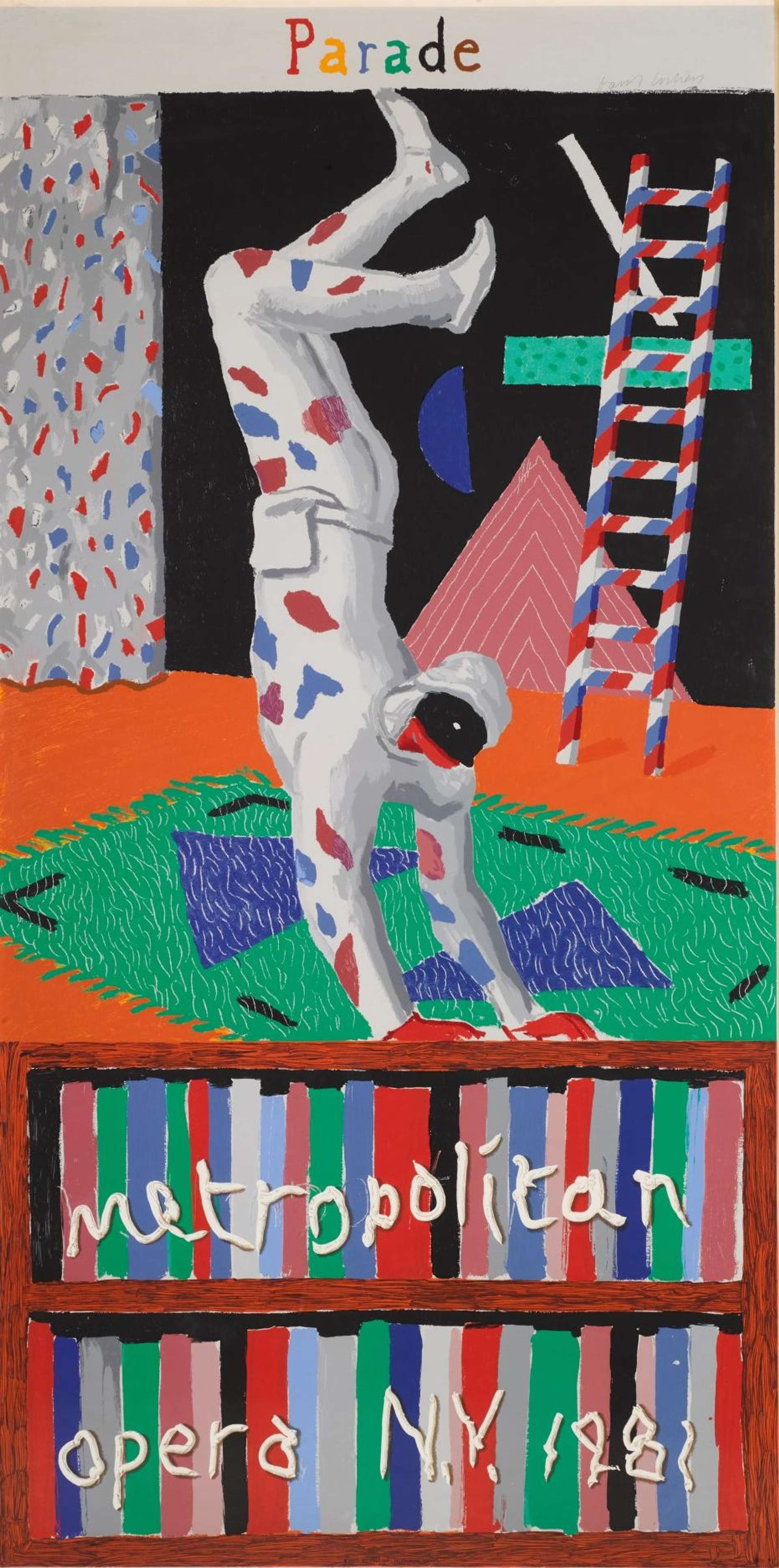
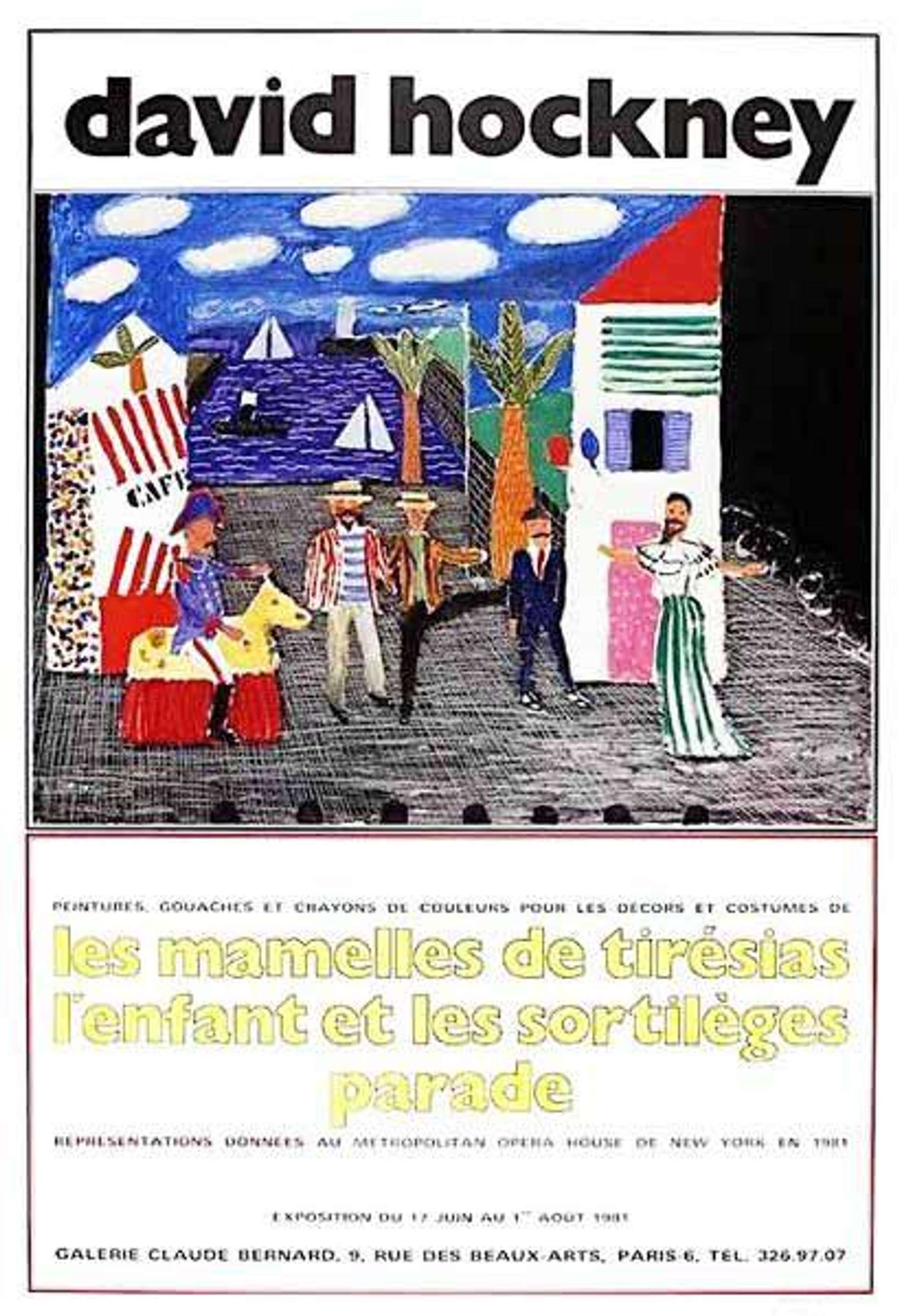
In February 1981, the Metropolitan Opera in New York City asked Hockney to design the stage and costumes for three rarely-performed operas: Satie’s Parade, Poulenc’s Les Mamelles de Tirésias and Ravel’s L’enfant et les Sortilèges. Parade in particular had a strong precedent for artist involvement: the original 1917 production was designed by none other than Pablo Picasso himself. Hockney chose to allude and be inspired by Picasso's take, and featuring the signature harlequins from his Rose period. L’enfant et les Sortilèges, on the other hand, was noted for being Hockney's favourite of the three.
In a contemporary review by the New York Times, the Opera received a glowing endorsement: “Every so often, and sometimes none too soon, something happens at the opera to justify its existence and restore faith in its present and future.” Hockney's designs are praised for having “exactly the right tone.”
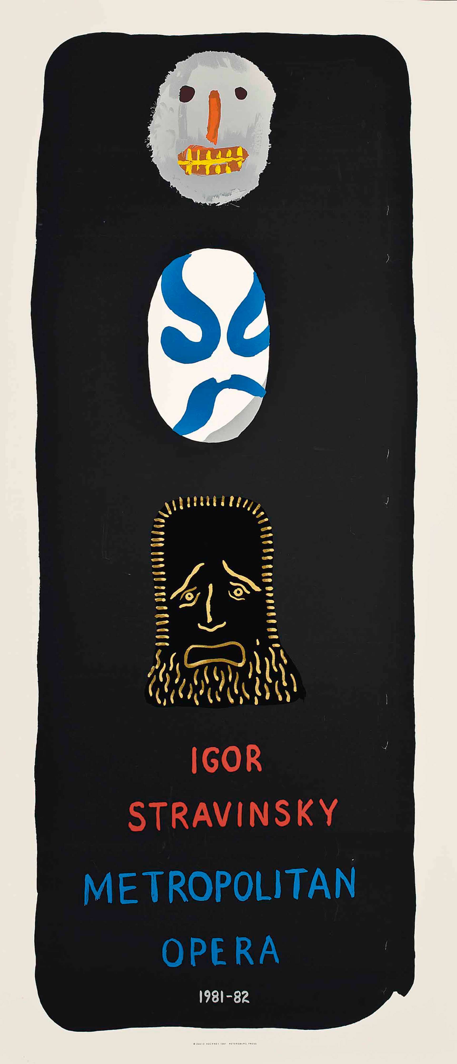
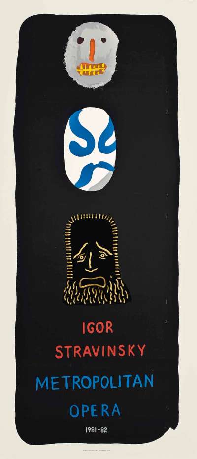
Stravinksy Triple Bill (1981)
After the success of the Parade Triple Bill, the Met commissions Hockney to work with John Dexter again, this time for a triple bill of Igor Stravinsky’s works: Le Sacre du Printemps, Le Rossignol and Oedipus Rex. It had a quick turnaround, debuting at the end of the same year. While the production was not considered to be as successful as the previous ones, Hockney’s designs for Le Rossignol in particular were praised.
Tristan und Isolde (1987)
By this point, Hockney’s set designs had achieved considerable success and even been the subject of an exhibition in 1983, Hockney Paints the Stage at the Walker Art Centre in Minneapolis, USA. For this, he recreated many of his previous sets, adapting them to be seen in a gallery setting.
Hockney was an experienced designer by the time he worked on Tristan und Isolde, and had learned to consider lighting from the very beginning of the process, creating a miniature set in his studio. He was also very interested in being involved with this specific opera, as it “takes place entirely outside [and] staging nature seemed like an interesting challenge.” The show opened in December 1987 at the Los Angeles Music Center Opera, and Hockney’s designs received rave reviews. They are defined by soft, curving elements, with a more pastel tonality than the designs of 1981. Once again, Hockney’s work received positive reviews, with The New York Times stating: “Hockney rose to the notorious challenge and whisked us in a matter of seconds to a world in which all life was extinguished and all light doused, and from there to a transfigured universe in which time past, time present and time to come were somehow in equilibrium. It was as awesome a moment as we shall ever see on a stage.”
Turandot (1992)
In January 1992, the opera Turandot finally opened at the Lyric Opera of Chicago, featuring a technically innovative production design that had consumed Hockney's life for the previous two years. Set in China, the opera chronicles Prince Calaf's love for the cold Princess Turandot. Suitors must solve three riddles to marry her, with failure leading to death. Though Calaf succeeds, Turandot hesitates, so he challenges her to guess his name by dawn or accept their union.
Red and blue predominated the production, at times comforting or ominous, and inspired by China's history: Red for good fortune, and the blue of its iconic porcelain. Reviews of the set praised the "abstracted Forbidden City of alternately sharp angles and interlaced curves", which created a strong contrast "between the unrelenting geometry of the setting and the extreme lyricism of the music". Hockney himself spoke of his desire to modernise the set design: "One of the reasons I wanted to do it was that I felt it was possible to simplify it, to get rid of the grotesque chinoiserie."
Die Frau Ohne Schatten (1992)
In November of 1992, Hockney designed the set for John Cox's staging of Die Frau Ohne Schatten by Richard Strauss at the Royal Opera House in Covent Garden, London. The opera delves into the mystical world where a celestial empress, who lacks a shadow, must obtain one in order to secure her husband's love and prevent him from turning to stone. The opera explores profound themes of love, sacrifice, and the human desire for offspring.
For this opera, Hockney created intensely coloured sets, with surrealist elements. This proved to be Hockney's last foray into opera set designs, as the artist was becoming increasingly hearing impaired and felt incapable of working with music. Since then, this production has been staged again with Hockney's designs at the San Francisco Opera in June 2023.
More on Hockney's Love for Opera: The Colours of Music and Lightroom
Hockney's love affair with the opera was explored in the 2003 documentary David Hockney: The Colours of Music. It explores his creative process, his passion for music and career in set and stage design.
For most of 2023, Hockney has an immersive exhibition titled Bigger & Closer at Lightroom in London. A section of the show revisits the vibrantly colorful postmodern opera visuals crafted by Hockney in the 1970s and 80s, allowing people to experience their magic in a highly accessible way.
Hockney's passion for opera has been praised for its importance, especially at the time where the medium is sometimes seen as obsolete. His designs for productions have remained relevant and contemporary, continuing to be staged decades later.