


How to Make an Interactive Infographic [+Templates]


Written by:
Mahnoor Sheikh

An infographic is a powerful way to communicate data, ideas and knowledge in a visual format. It combines visual elements like charts, diagrams and illustrations, along with minimal text to explain topics in a way that’s easy to grasp.
While it may seem like a new concept, infographics have been around for a long time
In fact, they’ve exploded in popularity in virtually every industry. From digital marketing to schools and classrooms, infographics are being used everywhere to communicate complex information in a visually engaging way.
If you’re new to design and don't know anything about infographics or how to make the most of it, this short guide is created just for you.
In this article, we’ve covered everything you need to know about creating infographics. You’ll also find creative infographic examples and editable templates sprinkled throughout this article so you can start creating your own visuals.
But first…
Here’s a short selection of 10 easy-to-edit infographic templates you can edit, share and download with Visme. View more templates below:


By definition, an infographic is a visual representation of any kind of information, data or knowledge. Infographics combine various elements, such as text, images, charts, and diagrams, to provide a clear, engaging and easily understood summary of a complex topic.
Whether it’s a study on market trends or a step-by-step guide on how to do your laundry, an infographic can help you present that information in the form of an attractive visual graphic.
Pro-tip: You can easily create your own infographics online using Visme's infographic maker. It comes with simple, drag-and-drop design tools and hundreds of customizable templates.Take a look at the infographic example below from the Visme template library.
It explains how marketers can use content as a selling tool. Notice how the use of bright colors, illustrated icons, and bold text instantly grabs your attention and gives you an overview of the topic as you skim through it.
Keep in mind that the goal of an infographic is not only to inform but also to make the viewing experience fun and engaging for your audience. As you can see in the infographic below, there are different types of infographics you can create.
The secret to creating an exceptional infographic all comes down to how you combine different graphic elements—like colors, icons, images, illustrations and fonts—to explain a topic in a compelling and easy-to-understand way.
Here’s another infographic above that showcases the statistics and percentages in a visual form using a combination of pie charts, bar graphs, icons and maps. So, even if you don’t read the text above the data widgets, you’ll still get the picture.
There’s a reason why infographics are so popular—they’re fun, engaging and super easy to share. Plus, they have tons of benefits for all kinds of content creators, including businesses, educators and nonprofits.
Marketers can use infographics to drive more website traffic, increase visibility and brand awareness, and boost engagement. They are also highly linkable content assets, meaning they can generate valuable backlinks that boost SEO efforts.
Educators and trainers can use infographics to explain difficult concepts or break down complex information to make it easier to understand.
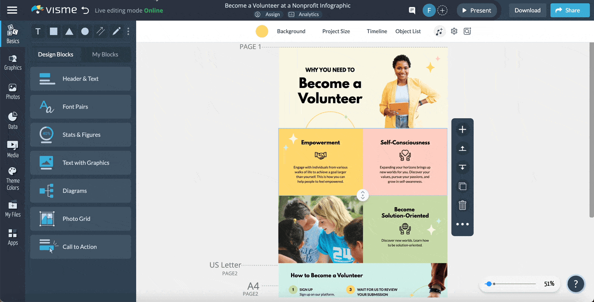
Nonprofits can use infographics to spread awareness about a cause or social issue.
Here’s an example of how the Environmental Protection Agency (EPA) is using an infographic to create awareness about leaks.
In this article, we’ve shared 101 infographic examples to give you all the inspiration you need to create beautiful infographics.
Creating a beautiful infographic can be tricky, especially if you’re not a professional designer. However, Visme makes it a breeze.
With a Visme account, you get access to thousands of professionally designed infographic templates, millions of design assets and dozens of advanced features.
You don’t need to be a designer to use it, but even your designer would love it!
Check out this video to find out how you can create an infographic in Visme.
Additionally, here’s a step-by-step guide to creating an infographic using Visme’s drag-and-drop editor and premade templates.
The first step is to sign up on Visme (it's free!) and choose a template to get started with.
Browse through hundreds of free and premium infographic templates inside the dashboard to find one that works best with your content and purpose.
When you find one you like, hover on it and click “Edit.”
If you need help or are running against the clock, Visme’s AI Designer can do the heavy lifting for you.
Just write a detailed prompt describing the type of infographic you want to create, along with the details of the design and content. Choose your design theme and watch the tool generate compelling infographics filled with text, charts and other design elements.
Whether you're using the template or the AI designer, Visme gives you complete control over your infographic design and content.
When you finally select a template or design theme to edit, you’ll redirected to the Visme editor.
This is where you get to customize the infographic with your own colors, fonts, text, images, icons and much more and make it entirely your own.
Start by replacing the dummy text with yours. Even if you’re facing writer's block, Visme AI text writer is right there to help you. With a text prompt, you can generate content ideas for your infographics and create outlines, headlines and draft copy. It can also assist in proofreading and editing your text for grammar, clarity, and conciseness.
In fact, you can change the entire color scheme of your infographic in one go using our preset color themes. Or automatically generate with the Brand Design Tool and save your assets in your brand kit. This allows you to apply your branding to any design with a single click.
Visme also gives you unlimited access to the following:

Even if you don't find visuals that align with your vision, Visme offers an AI image generator. Whip up beautiful visuals in a variety of output styles: photos, paintings, pencil drawings, 3D graphics, icons, abstract art, and more—using a text prompt
Exciting, right? The best part is that this takes literally a few minutes because of the drag-and-drop editor.
You can also add links and animations, upload your own brand assets, add data visualizations like charts and graphs, and add new content blocks to extend your infographic.
Check out our infographic design guide for more tips on how to make an eye-catching infographic!
Elevate your infographic and hold the reader's attention with animation and interactive features like animated graphics and charts, animated text and objects, gestures and illustrations, links, hotspots, hover effects and pop-ups.
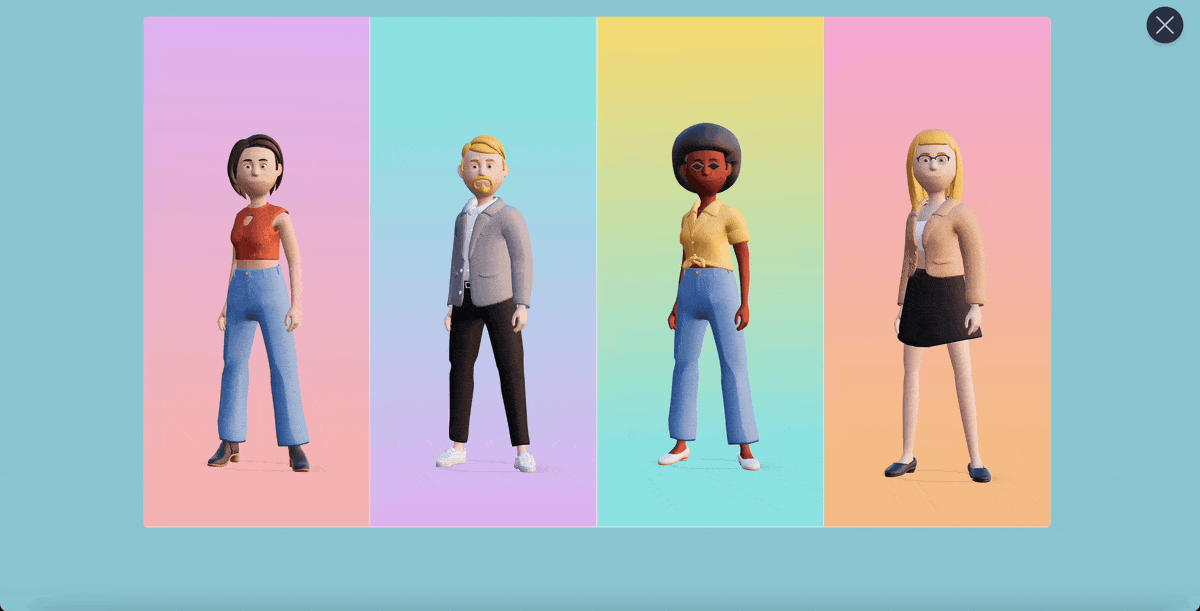
Bring life to your infographic by adding cool and sleek 3D animated characters. With our 3D character creator, you can customize their apparel, hair, gender, skin tone, and more until you’re satisfied with the final appearance. You also have the freedom to select their entry, waiting and exit poses.
But that's not all…You can embed interactive content in your infographic, like forms, audio, video and GIFs to make it memorable.
That’s it—you’re almost done!
After you’ve finished customizing your infographic, it’s time to download or share it with your audience in a variety of ways.
You can either download it for offline use in image, PDF or HTML5 formats. Or generate a link to share it privately with specific people.

You can also embed it on your website or blog using a responsive code, or publish it on the web so anyone can search for and access it.
After you’ve shared your infographics online, use Visme’s analytics to keep an eye on how your audience engages with it. You can find out who viewed it, the date and time of the view, the visitor's IP address, their location, the time spent on your project, and which sections they spent more time on.

There’s no one-size-fits-all infographic out there.
Infographics are of various different types, and if you want yours to actually be effective, you need to pick a type that’s aligned with your purpose and nature of content.
In this video, we've covered the 13 types of infographics and when to use them, plus we've included templates to help you get started.
Generally, infographics are used for one or more of the following reasons:
Once you’re sure about what you need an infographic for, you can move on to selecting the right type of infographic for your needs.
Here are the different types of infographics available in Visme.
Statistical infographics make use of typography, charts and graphs to present research, facts and figures in a visual way. This helps make data look more interesting and easier to digest than a bunch of plain numbers or tables.
A statistical infographic can either focus on a single research or data visualization or use a mix of different visualizations to present various facts and figures about a topic.
The infographic template below displays data about the global penetration of social platforms using bar graphs
This type of statistical infographic is ideal for use as part of a report or presentation or for visualizing a statistic mentioned in your blog post.
Now, take a look at the infographic template below. Instead of a single visualization, it focuses on giving a statistical overview of a more general topic—cybersecurity.
This type of statistical infographics is ideal for educational purposes and creating awareness about a subject or cause.
Statistical infographics are usually less text-heavy and more data-focused. In the Visme editor, you get access to 50+ types of data visualizations, including charts and graphs, maps, diagrams, histograms, pictograms and widgets—in 2D and 3D formats.
.
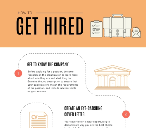
Informational infographics use a mix of text and visual elements to explain or simplify a topic, or guide readers through a series of steps.
The example below explains how to grow an email list with the help of a colorful informational infographic that’s easy to follow and fun to read.
These are usually text-heavy infographics and can be used to summarize long blog posts and videos. You can also share an informational infographic as a stand-alone content piece.
Check out this informational infographic template to use for your own content.
Informational infographics usually follow a visual narrative to tell a story. This includes leveraging font size and styling, imagery and the placement of different objects to lead the reader’s eye from one point to the next in the order of importance or position.
Process infographics usually make use of flowcharts, diagrams and even timelines to guide readers through a series of steps or to help simplify the decision-making process.
Here’s an example of a process infographic template.
These types of infographics are useful for giving instructions to employees, explaining a step-by-step process to customers or for light-hearted, humorous purposes.
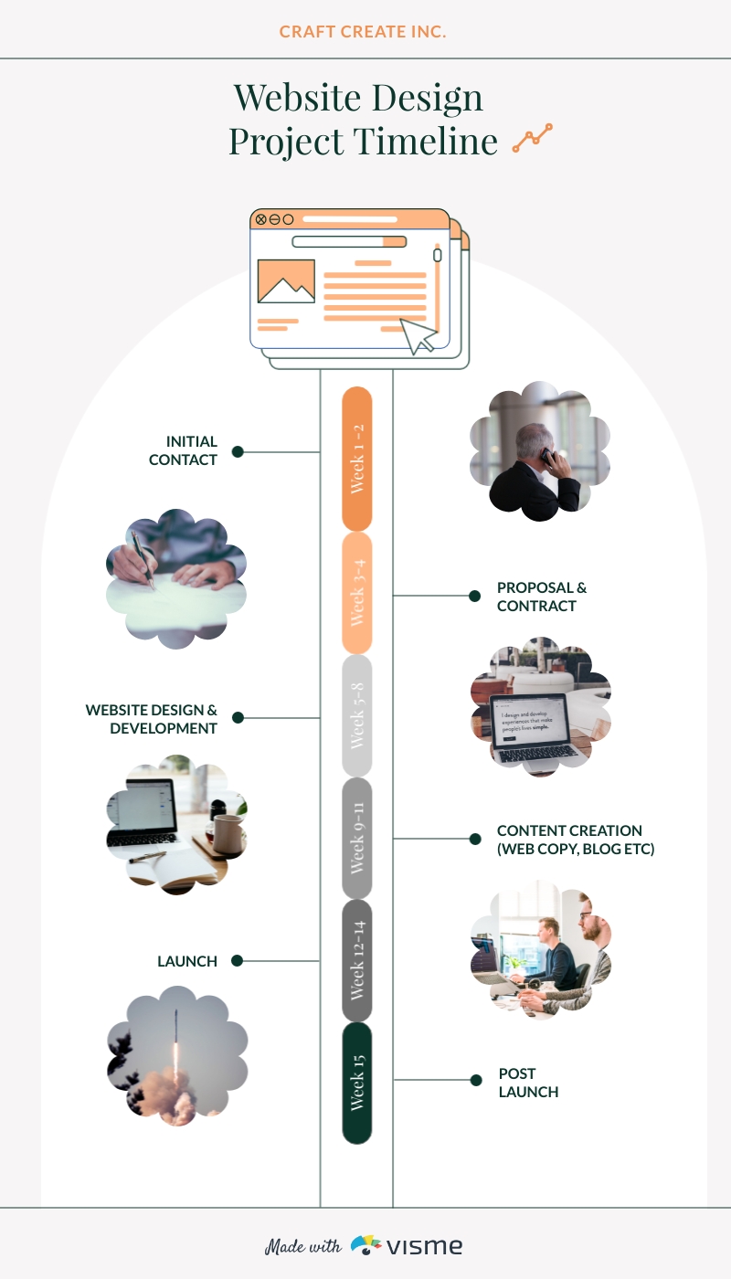
Timeline infographics are useful for presenting information in a chronological order. Whether you’re visually showcasing your brand history or showing how something has evolved over time, a timeline infographic can help you out.
Here’s a horizontal timeline infographic template from Visme to get you started.
If you want to create a vertical timeline infographic, below is a template to help you.
You can use a timeline infographic to creatively display your brand story on your website’s About page.
This type of infographic can also help you with project management purposes, such as creating project timelines.
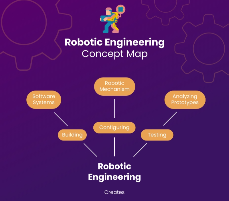
Looking to break down and explain the different parts of something? An anatomical infographic can help you do just that.
This type of infographic has a labeled diagram format, which can help you highlight and explain ingredients, product parts, characteristics, personality traits, and more.
Check out this anatomical infographic template as an example. It breaks down the key elements of a great ad copy.
Here’s another example of an anatomical infographic that explains the different moving parts of a sales business plan.
This type of infographic usually features a pyramid to help you display different levels of information.
Take a look at the hierarchical infographic template below.
If you want to organize information by different levels, such as by priority, importance or difficulty, a hierarchical infographic like the one above is a good way to go.
List infographics help you summarize and present list-based information. This could be a list of items, factors and even steps to do something.
Here’s a list infographic template you can customize.
You can use this type of infographic to sum up a how-to or listicle blog post. List infographics are also likely to get shared as they’re usually straightforward and fun to read.
Comparison infographics are useful for comparing multiple objects, people, concepts, products or brands. Visually comparing ideas can help illustrate similarities and differences.
Here’s an example of a comparison infographic template.
These types of infographics usually have a multi-column layout, which is useful for comparing and contrasting two different topics side by side.
Another type of comparison infographic is a comparison chart, which compares and contrasts multiple features or brands in the form of a visual table.
Here’s a comparison chart template for that purpose.
If you want to showcase geographic information in a visual form, a location-based or map infographic is a great option.
Here’s a map infographic template from Visme.
Map or location infographics can be used to display local, national or global data and statistics. You can color-code the map to highlight different regions, and even make them interactive by adding hover effects, links and animations.
Location-based infographics make excellent visuals to add to your blog posts, reports and presentations. You can also use them as solo graphics and share on social media to drive engagement and traffic.
Employers receive hundreds of resumes at a time and only a handful of them manage to stand out from the pile. If you want to take your resume to the next level, consider creating a visual resume infographic.
Check out this creative resume infographic template.

Resume infographics offer a refreshingly new take on the standard infographic style. They make use of visualizations like radials, progress bars, icons and arrows to illustrate skills, interests, experiences and more.
Now that you know the different types of infographics you can use and how to create one for yourself, here are some tips to help you take your visuals to the next level.
The most important piece of homework you need to do before creating an infographic is to find out if it will actually work with your audience.
Understand the kind of topics they like and what type of design will appeal to them. You also need to know the kind of tone that works with your audience, as you’ll use that to craft compelling copy for your infographic.
You also need to know the social channels that are most used by your audience so you can create an infographic that is optimized to perform best on those specific platforms.
There are plenty of ways to figure out what type of infographic your audience will connect with.
There are millions of infographics and visuals floating on the internet. If you want to get yours noticed, create something unique and different.
Do some research before creating your infographic. Find out what kind of topics will appeal to your audience and what questions they might have unanswered. You can do keyword research to find topics that resonate with your audience.
Then go ahead and do a Google search to see if there are any existing interesting visuals or infographics on the topic.
If it’s a topic that’s already been covered before but you still want to create an infographic about it, make sure you create it with a fresh, new angle.
For example, if you're creating an infographic on improving employee productivity, analyze existing ones to see if they focus primarily on time management and overlook technology integration. This gap could be your unique angle.
Using original research or data can set your infographic apart. So you want to conduct surveys, collect unique statistics, interview experts or use case studies to provide fresh insights not found elsewhere.
Color psychology is real. And marketers all over the world rely on it to create effective designs that actually bring results.
If your infographic doesn’t use colors and fonts that resonate with your audience or bring your content to life, it might fail to stand out. In Visme, you get dozens of pre-made color combinations or create and save your own color palettes for future design projects.
Remember to keep your infographic consistent with your brand identity. This creates a cohesive look and helps with brand recall.
Visme’s brand wizard can help pull in all of your brand assets and save them in your brand kit. All you need to do is input your URL. You’ll even get beautiful templates crafted to suit your branding.
Check out these resources put together by experts to help you choose the best colors and fonts for your infographic designs.
Additionally, check out this video on color psychology in marketing to help guide your designs.
Too much text can make an infographic look boring and uninteresting.
Make sure you use as many visuals and as less text as you can. One way to do that is to replace or supplement subheadings, labels, captions and other text in your infographic with icons, illustrations or images.
Don’t settle for run-of-the-mill visuals that lack aesthetic value. Instead, invest in high-quality images, icons, illustrations, and graphics that captivate your audience and hold their attention. As we mentioned earlier, Visme comes packed with millions of stock photos and other types of design assets to make your infographics pack a punch. You can even build unique characters that take your infographic storytelling to the next level.

Simplify content creation
and brand management for your team
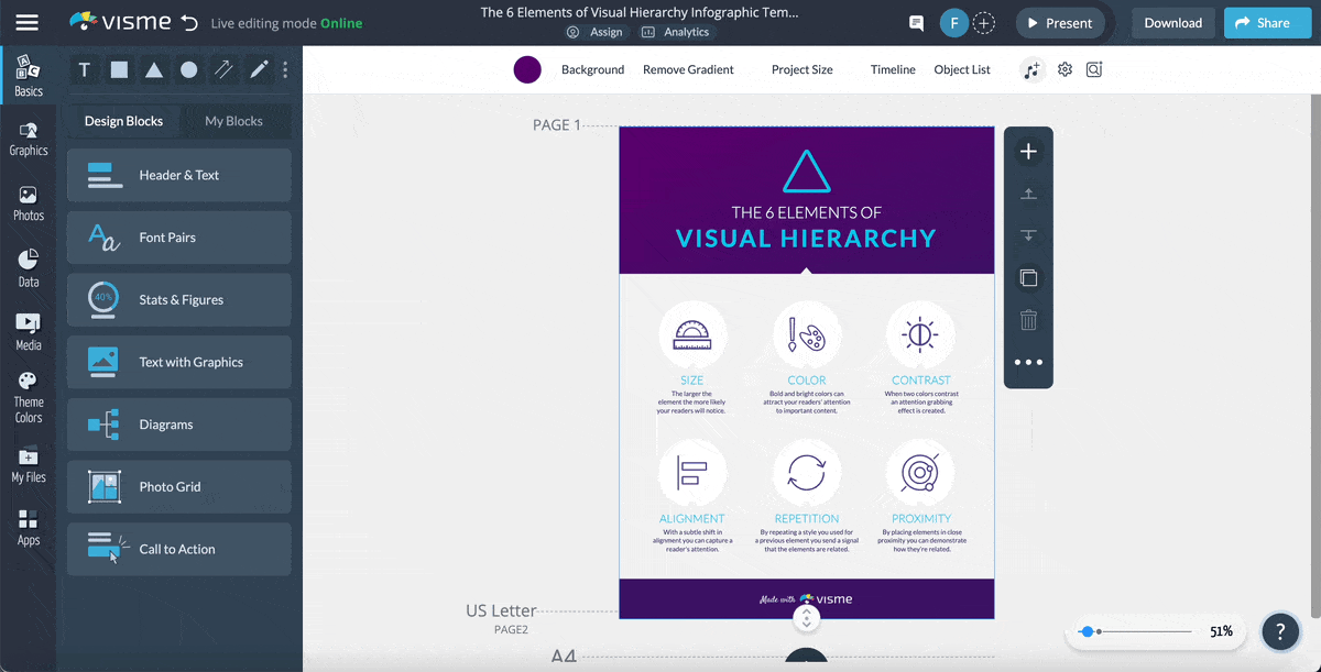
Visual hierarchy is all about organizing information on your design according to the level of importance or order so that the reader’s eye naturally goes from one section to the next.
Establishing a visual hierarchy makes your infographic design look cleaner, more attractive and more professional instead of cluttered with all kinds of information.
For example, headings, subheadings, and sections can help break up the information into sections. Different font sizes and weights can help show which parts are more important, while bold or larger fonts can make key statistics or important points stand out.
Another critical element of visual hierarchy is spacing and alignment. With ample white space, your infographic looks uncluttered, clean, organized and easy to read.
This infographic shares a brief overview of the six elements of visual hierarchy.
If you really want to make your infographic stand out, consider taking it a step further from just being a static image.
The reason is simple—-attention spans are shrinking. Adding an element of interactivity will do a great job of captivating and holding your audience’s attention.
Visme offers a wide array of animation and interactive features that will not only elevate your infographics but also engage viewers and enhance the overall experience.
You can add animated graphics, charts, text, objects, gestures and illustrations to your infographic, insert clickable links, hotspots and buttons, and even add pop-ups and hover effects.
For example, you can include hotspots that, when hovered over, display additional data or context and links to in-depth reports or case studies.
Supercharge your infographics by incorporating trendy 3D animated characters and widgets for a more dynamic visual experience.
What’s more…Embed interactive content like forms, audio, video, and GIFs to make your infographic memorable and engaging. These elements can provide deeper insights, encourage viewer participation, and make the infographic more dynamic.
Infographics are one of the most effective types of content out there, for good reason.
They’re visual, shareable, fun to look at, and can make even the most boring and technical information look interesting.
Now that you know what an infographic is, when to use it and how to create one, it’s time to get started with your own. Visme offers thousands of professionally designed templates, millions of design assets, dozens of intuitive features, AI-powered tools, collaboration and workflow management features to help streamline your content creation process.
Try out Visme's infographic maker for free and take it for a test drive!
Happy creating!
Design visual brand experiences for your business whether you are a seasoned designer or a total novice.
Try Visme for free


About the Author
Mahnoor Sheikh is the content marketing manager at Visme. She has years of experience in content strategy and execution, SEO copywriting and graphic design. She is also the founder of MASH Content and is passionate about tea, kittens and traveling with her husband. Get in touch with her on LinkedIn.